Back

Guides

Community created guides, helpful strategies, and more.
TOPIC | Drawing Tut. - Half-Finished!
1 2
Update 1st March
I don't think I'll ever finish this, but I still recommend that you take a look ^^

---
Hello! This is going to become a skin guide, focusing on setting up a workspace in photoshop, useful commandos, basic color and shading theory and so forth. Though it wasn't my intention from the beginning, this has ended up as a very detailed tutorial. I will most likely do a shporter version afterwards.

It will take quite some time for me to finish this! I've wanted to do this for a while, but I'm still beginning from scratch. So bear with me.


Introduction

reminder to self: remember to put the interest of the reader before information. People aren't here to get a guide on how to use everything - they're here to make skins. So explain from that perspective.

To-do list:
- Explain history brush, the band aid, and the stamp.
Table of Contents

Information
Rules
Copyright vs Inspiration

Photoshop
Setting up a workplace
Tools

General Drawing Tips 'n Tricks
Tips for Drawing
Mindset

Color Theory
How to pick colors
Useful links and resources

Shading Theory
Shapes
Environmental Light
Specific Objects

Lets Make a skin
Rules

The very first thing we'll do is go through the most important rules one more time. I've seen enough skins in the Skin Contest threads to know that some people forget / don't read them. I will also elaborate on them a bit, from how I've understood them.

Remember, THESE ARE IMPORTANT. If you do not follow them, all your hard work on your skin will be in vain!

Also, please read through the skin section and the official tutorial first!

_-_-_-_-_-_-_-_-_-_-_-_-_-_-_-_-_-_-_-_-_-_-_-_-_-_-_-_-_-_-_-_-_-_-_-_-

1. The skin that is submitted must be the correct size and format
The last thing you do with your skin is rezise it to 350x350 pixels. You can't change the placement of the dragon either. The format should be transparent PNG-24

2. Do not alter the Lineart
While you can color the linart, you can't change the lines themselves. Nor can you draw outside of the lineart.

3. The Lineart must be noticibly darker than the color on which it rests.
While you may color the lineart, it must still be clearly visible when looking at the skin

4. Avoid pure and near-pure black
Skins that are pure 100% black or near will not be accepted. The most important thing is that the shadow and lineart layers are clearly visible. Its also important to remember that an image may seem lighter or darker depending on what colors are around it and what monitor you use.

5. Do not alter the Shadow Layer (altough you can tint it)
Altering the shadow layer is a no-go. However, you can tint it to other colors. Actually I reccomend you do that, but more on that later.

6. Do not use stock photos or overwhelming textures
Stock photos are not allowed, the end. While textures are o.k. its still important to not over-do it.

7. Refrain from using other people's patterns, textures and notable brushes
This rule is not present in the original text, however due to copyright reasons I largely warn against using other people's textures, patterns and notable brushes without their permission.
By notable brush, I mean those that create an easily recognizable pattern or symbol. Fire, smoke or leaf brushes for example are still ok.


8. Do not clearly reference copyright material.
Like putting a Zingo logo on a dragon. Don't


Copyright vs Inspiration
How to use references


What? What is this about?

Basically, I want to give a short discussion regarding how to use references, and the ever-lasting debate regarding orginality, copyright and inspiration.

When we draw, its natural we get inspiration from other sources. This is something that has existed as long as humanity has walked on earth - how often have we not heard of people fondly talking about what inspired them to create their own art? But by doing this, there is always the possibility of going a bit to far, and copying the inspiration instead.

One thing I want to adress is that some things are simply put not copyrighted. The older, more natural and more common something is, generally the lower copyright value it holds.

Will need to add more and refine this section one day.


[center][size=7][b][color=#5c4e0e]Photoshop[/color][/b][/size][/center] [color=#5c4e0e] Knowing your workplace is one of the keys to improvement. I will use photoshop for this tutorial, since it is one of the most used programs and it is the one I myself use and is most comfortable with. This version is Photoshop CC. There may be differences between the various versions. I also use a tablet. [/color] [center][size=6][color=#5c4e0e][b]Setting up a Workplace[/b][/color][/size][/center] [color=#5c4e0e] [center][img]http://fc06.deviantart.net/fs71/f/2014/011/b/9/workspace_by_nin_wolf-d71suv9.png[/img][/center] [color=#5c4e0e] What you see here is how my workspace looks when creating a skin. How it looks changes from person to person, and you'll find yourself organizing your own version. This is merely one way to do it. So lets break it down! [/color] [color=#5c4e0e] [size=4][u][b]1. Toolbar [/b][/u][/size] Here are all of your tools, most notably the brush and eraser. If you're new to photoshop, I'll reccomend playing around with them first. I will explain some of the tools in detail later. If you ever manage to click away the toolbar, simply go to Window and make sure "tools" is checked. [size=4][b][u]2. Brush[/u][/b][/size] To find this, go to Window and check "brush". You can also press F5 for quick access. This is where you can create your own custom brushes. Like with the toolbar, I reccomend that you read a tutorial or play around with them. There are many fancy things you can do here. [size=4][u][b]3. The Images [/b][/u][/size] When making a skin, I have three tabs open: The Skin i'm working on, a duplicate window for the skin and an optional reference page. There is a good reason for having two windows of the same skin. By doing the following: [i] Windows > Arrange > New Window for X[/i] You will 'duplicate' your existing image. Both of these images are in reality one and the same; any changes done to the first will happen to the second. [i]Now once you've done this, do Windows > Arrange > 2-up vertical[/i] This will neatly arrange your two windows. Click on one of them, resize it to around 50% (I do so by using the navigator, which is explained next). This small window will stimulate how your skin will look once it is resized. It is surprisingly helpful, and let you sort our details that wont appear once you resize it. Drag one of the windows so that the big image gets as much space as possible. This big image will be what you work on. Sometimes, altough not always, I also create a third image called "references". Here I put all of my photo references for quick access. [/color] [color=#5c4e0e] [size=4][b][u]4. Navigator[/u][/b][/size] [img]http://fc03.deviantart.net/fs71/f/2014/011/8/2/navigator_by_nin_wolf-d71szkx.png[/img] [i]Window > Navigator[/i] This is a neat little window that will make it easy to navigate your drawing. [LIST] [*][color=#5c4e0e]By moving the red square, you will move across your image.[/color] [*][color=#5c4e0e]By using the sliders and the two icons on either end, you can quickly zoom in and out.[/color] [*][color=#5c4e0e]The % number shows how zoomed in you are. 100% is the real size of the image. [/color] [/LIST] [color=#5c4e0e] [size=4][u][b]5. Color Picker[/b][/u][/size] [img]http://fc09.deviantart.net/fs70/f/2014/012/7/b/color_by_nin_wolf-d71w6j2.png[/img] [i]Window > Color[/i] if you click the icon in the top right, you can choose between various color pickers. As you can see on the two squares. you can pick two colors, Generally the second color (the square behind the other) doesn't do anything. However, by hitting 'X' you can switch the two, which makes for fast changing between two colors. [size=4][u][b]6. History[/b][/u][/size] [img]http://fc02.deviantart.net/fs70/f/2014/012/d/0/history_by_nin_wolf-d71w6iv.png[/img] [i]Window > History[/i] This window will record all your actions as you draw, and is useful for quickly going back. However, it will only track your most recent ones, and only those you've made in this session (ex. if you close and then open your image the history will have dissappeared). For quickly erasing you mistakes, I'd recommend using[i] Ctrl+Alt+Z[/i] ([i]Ctrl+Z[/i] in some versions / other programs) [b]1. [/b]By clicking on the mini-image of your drawing, the image will be returned to the state it was in when you opened the file. [b]2. [/b]You see all those squares? By clicking one, you will save that action. You can only have one saved action at a time. What this does is that for this session, the history will always remember that step and you can return to how the image looked at that moment. This is very useful when you're happy with your drawing, but want to experiment more. Since the history will auto-delete older actions, by saving one you can make sure you can always return to that point in time. It is also needed for the History Brush. [b]3. [/b] Click here to create a duplicate of your drawing. [size=4][u][b]7. Layers[/b][/u][/size] [img]http://fc02.deviantart.net/fs70/f/2014/012/e/8/layers_by_nin_wolf-d71w6in.png[/img] Layers, one of the best things with digital painting. You can consider layers as a transparent sheet of paper, which you can then stack upon each other. Also, regarding 1, 2, 3 and 5 - while I will talk about what these functions do,[u] do not change them on the pre-existing layers.[/u] You can make your own layers while creating a skin and play around with these, however. [b]1. Blending Modes [/b] By altering the blending mode, you will change the way the layer works with colors and other layers. One of the most famous is 'multiply', which darkens any color on the layer, which is useful for shading. [b]2. Opacity[/b] Change the transparency of the layer [b]3. Lock Transparent Pixels[/b] By clicking this icon, you will lock the layer in such a way that you can only draw on what is already drawn. Useful when you have a certain shape you want to work on, but don't want to color outside it. [b]4. Lock All[/b] This will completely lock the layer, making it impossible to alter it in any way until you unlock it. Comes in handy when you want to make sure you don't accidently draw on the wrong layer, among others. [b]5. Visibility[/b] Here you can hide/un-hide a layer. [b]6. Create Group[/b] [i]Ctrl+G[/i] Creates a folder. Useful when working with many layers and/or when you need to organize them. [b]7. New Layer[/b] [i]Shift+Ctrl+N[/i] Create a new layer [b]8. Erase Layer[/b] Remove the selected layer. [/color] [/color] _-_-_-_-_-_-_-_-_-_-_-_-_-_-_-_-_-_-_-_-_-_-_-_-_-_-_-_-_-_-_-_-_-_-_-_- [center][size=6][b]Tools[/b][/size][/center] Yes, I am crazy enough to go through almost every single tool in photoshop. Far from all of these are useful for skins, but meh, if I'm going to go through them I may as well go through them all. "X" means I won't go through this tool. Letters in "()" are keyboard shortcuts to that tool. Shortcuts may vary from program to program. You can change the shortcuts [i]Edit > Keyboard Shortcuts.[/i] Several tools have hidden menus. Right click the tool, or hold it down with the left mouse button, to access it. [b]Quickguide[/b] Fixing Mistakes - #7, #9 Useful for drawing - TBA Navigating your drawing - #1, #2, #3, #19 [img]http://fc07.deviantart.net/fs70/f/2014/047/4/9/tools2_by_nin_wolf-d76q4hq.png[/img] [u][size=4][b]Navigation, Selection, Cropping and Colorpicking[/b][/size][/u] Right click to access a menu. These tools are useful navigating and editing your image. [b]1. Move (V)[/b] Use it to move your drawing. Right click on an image to gain quick access to any layer present where you clicked. If you only want to move around the drawing, not move the actual image, go to #19 or use the navigator. [b]2. Rectangular Marquee (M)[/b] For quick selection with a pre-determined shape. The menu contains different shapes, but the rectangular one tends to be most useful. While this tool is selected, you can move your selection without moving the selected image. Right click and press "deselect" to remove the selection. By holding down shift, you can add more to your selection. [b]3. The Lasso Tools (L)[/b] Works exactly like the Marquee tools (#2 above this post), but more free. 3A Lasso Tool A free-hand selection tool. 3B Polygonal Lasso Tool A selection tool where you go from spot to spot until you've completed the selection by clicking the beginning point. Useful for more controlled selections, but can be a bit frustrating. [b]4. Magic Wand (W)[/b] Photoshop tries to select an area based on color. May or may not work. Change the tolerance (in the bar on top) to adjust how picky the tool is. [b]5. Crop (C)[/b] Make your drawing smaller or bigger. DO NOT USE WHEN MAKING SKINS! Its useful for other drawings though :3 [b]6. Eyedropper (I)[/b] Quickly change your colors. You're much better of just holding [i]alt[/i] while coloring with the brush though. [u][size=4][b]Brush Tools[/b][/size][/u] Varius brushes. If you right click while any of them are selected, you will access a menu where you can change sizes and other fun things. All of these tools are brushes that you paint with. [b]7. Spot healing Brush (J)[/b] The godly fix-itself tool. Simply draw over an area, and the program will try to fill it in. May end up in the most amazing fixes that would've taken hours to do yourself (though you may need to enchance them a little yourself - its still a time saver anyhow) or the most horrifying nightmare inducing sometimes outright hilarious idiotic fixes. [b]8. Brush (B)[/b] Its the brush. You draw with it. [b]9. Clone Stamp (S)[/b] An obscure but awesome tool, excellent for fixing mistakes. First, hold down [i]alt[/i] and select an area on your drawing. The brush is now "set" there. Then choose the area you want to fix, and start drawing. What happens now, is that you will actually have two brushes at the same time. The "set" brush and your own brush. Your own brush will copy whatever the set brush is hovering over. Once you start painting, the set brush will mirror your own movements. To re-set the set brush, simply press [i]alt[/i] again, choose a new spot to copy, and start painting again. I especially recommend using the clone stamp with an airbrush. [b]10. History Brush[/b] Remember what I told you about saving actions in the History (photoshop section, #6)? Well, here is a brush that takes advantage of that. When you draw with it, it will revert the part it touchest to how it looks in your current saved action. [b]11. Erasers[/b] 11A Eraser Your eraser. Erases things. 11B Magic Eraser Photoshop tries to delete an area based on color. May or may not work. Change the tolerance (in the bar on top) to adjust how picky the tool is. [b]12. Filling Tools[/b] 12A Gradient Tool Use this tool to fill your entire drawing or selected area with a gradient. See the colored bar at the top bar in photoshop? Click it to gain access to a variety of gradients. You can also make your own custom ones there. The checkered pattern indicates transparency. Personally I like the one-color / transparent gradient - it is excellent for giving your drawing an extra touch. 12B Paint Bucket Tool Photoshop tries to fill in an area of color with your selected color. You can set the opacity and tolerance in the top bar. [b]13. Blur/Sharpen/Smudge[/b] 13A Blur Blurs the image. Useful for a variety of fun effects, but be careful so you don't overuse it. 13B Sharpen Sharpens the image. Using it too much will create a very strange effect. 13C Smudge Smudges the image. Be very, very careful with this tool. If you use it too quickly and mindlessly draw a lot of big strokes at once it will take forever for photoshop to finish it, and the program may in worst case crash. So use it little by little. [b]14. Dodge/Burn/Sponge Tools[/b] 14A Dodge 14B Burn 14C Sponge [b]15. Vector[/b] [b]16. Type[/b] [b]17. Path Selection[/b] [b]18. Shape Tools[/b] (Rectangle, Rounded, Ellipse, Polygon) 18A Custom Shapes [b]19. Hand[/b] [b]20. Zoom[/b] [b]21. Colors[/b]
Photoshop


Knowing your workplace is one of the keys to improvement. I will use photoshop for this tutorial, since it is one of the most used programs and it is the one I myself use and is most comfortable with.

This version is Photoshop CC.
There may be differences between the various versions.
I also use a tablet.


Setting up a Workplace

workspace_by_nin_wolf-d71suv9.png

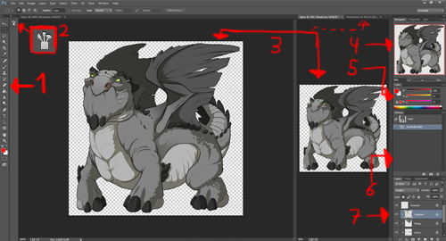
What you see here is how my workspace looks when creating a skin. How it looks changes from person to person, and you'll find yourself organizing your own version. This is merely one way to do it.

So lets break it down!


1. Toolbar
Here are all of your tools, most notably the brush and eraser. If you're new to photoshop, I'll reccomend playing around with them first. I will explain some of the tools in detail later.

If you ever manage to click away the toolbar, simply go to Window and make sure "tools" is checked.

2. Brush
To find this, go to Window and check "brush". You can also press F5 for quick access.

This is where you can create your own custom brushes. Like with the toolbar, I reccomend that you read a tutorial or play around with them. There are many fancy things you can do here.

3. The Images
When making a skin, I have three tabs open: The Skin i'm working on, a duplicate window for the skin and an optional reference page.

There is a good reason for having two windows of the same skin. By doing the following:

Windows > Arrange > New Window for X

You will 'duplicate' your existing image. Both of these images are in reality one and the same; any changes done to the first will happen to the second.

Now once you've done this, do Windows > Arrange > 2-up vertical

This will neatly arrange your two windows. Click on one of them, resize it to around 50% (I do so by using the navigator, which is explained next). This small window will stimulate how your skin will look once it is resized. It is surprisingly helpful, and let you sort our details that wont appear once you resize it.

Drag one of the windows so that the big image gets as much space as possible. This big image will be what you work on.

Sometimes, altough not always, I also create a third image called "references". Here I put all of my photo references for quick access.


4. Navigator
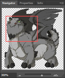
navigator_by_nin_wolf-d71szkx.png

Window > Navigator

This is a neat little window that will make it easy to navigate your drawing.

  • By moving the red square, you will move across your image.
  • By using the sliders and the two icons on either end, you can quickly zoom in and out.
  • The % number shows how zoomed in you are. 100% is the real size of the image.


5. Color Picker
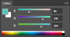
color_by_nin_wolf-d71w6j2.png
Window > Color

if you click the icon in the top right, you can choose between various color pickers.

As you can see on the two squares. you can pick two colors, Generally the second color (the square behind the other) doesn't do anything. However, by hitting 'X' you can switch the two, which makes for fast changing between two colors.

6. History
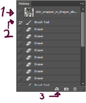
history_by_nin_wolf-d71w6iv.png
Window > History

This window will record all your actions as you draw, and is useful for quickly going back. However, it will only track your most recent ones, and only those you've made in this session (ex. if you close and then open your image the history will have dissappeared).

For quickly erasing you mistakes, I'd recommend using Ctrl+Alt+Z (Ctrl+Z in some versions / other programs)

1. By clicking on the mini-image of your drawing, the image will be returned to the state it was in when you opened the file.


2. You see all those squares? By clicking one, you will save that action. You can only have one saved action at a time. What this does is that for this session, the history will always remember that step and you can return to how the image looked at that moment.

This is very useful when you're happy with your drawing, but want to experiment more. Since the history will auto-delete older actions, by saving one you can make sure you can always return to that point in time.

It is also needed for the History Brush.

3. Click here to create a duplicate of your drawing.

7. Layers
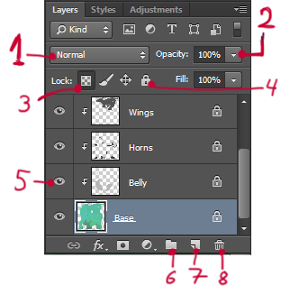
layers_by_nin_wolf-d71w6in.png

Layers, one of the best things with digital painting. You can consider layers as a transparent sheet of paper, which you can then stack upon each other.

Also, regarding 1, 2, 3 and 5 - while I will talk about what these functions do, do not change them on the pre-existing layers. You can make your own layers while creating a skin and play around with these, however.

1. Blending Modes
By altering the blending mode, you will change the way the layer works with colors and other layers. One of the most famous is 'multiply', which darkens any color on the layer, which is useful for shading.

2. Opacity
Change the transparency of the layer

3. Lock Transparent Pixels
By clicking this icon, you will lock the layer in such a way that you can only draw on what is already drawn. Useful when you have a certain shape you want to work on, but don't want to color outside it.

4. Lock All
This will completely lock the layer, making it impossible to alter it in any way until you unlock it. Comes in handy when you want to make sure you don't accidently draw on the wrong layer, among others.

5. Visibility
Here you can hide/un-hide a layer.

6. Create Group
Ctrl+G
Creates a folder. Useful when working with many layers and/or when you need to organize them.

7. New Layer
Shift+Ctrl+N
Create a new layer

8. Erase Layer
Remove the selected layer.


_-_-_-_-_-_-_-_-_-_-_-_-_-_-_-_-_-_-_-_-_-_-_-_-_-_-_-_-_-_-_-_-_-_-_-_-

Tools

Yes, I am crazy enough to go through almost every single tool in photoshop. Far from all of these are useful for skins, but meh, if I'm going to go through them I may as well go through them all.

"X" means I won't go through this tool. Letters in "()" are keyboard shortcuts to that tool. Shortcuts may vary from program to program. You can change the shortcuts Edit > Keyboard Shortcuts.
Several tools have hidden menus. Right click the tool, or hold it down with the left mouse button, to access it.

Quickguide
Fixing Mistakes - #7, #9
Useful for drawing - TBA
Navigating your drawing - #1, #2, #3, #19
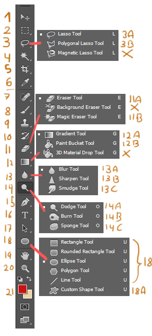
tools2_by_nin_wolf-d76q4hq.png

Navigation, Selection, Cropping and Colorpicking
Right click to access a menu. These tools are useful navigating and editing your image.

1. Move (V)
Use it to move your drawing. Right click on an image to gain quick access to any layer present where you clicked. If you only want to move around the drawing, not move the actual image, go to #19 or use the navigator.

2. Rectangular Marquee (M)
For quick selection with a pre-determined shape. The menu contains different shapes, but the rectangular one tends to be most useful.

While this tool is selected, you can move your selection without moving the selected image.
Right click and press "deselect" to remove the selection.
By holding down shift, you can add more to your selection.

3. The Lasso Tools (L)
Works exactly like the Marquee tools (#2 above this post), but more free.

3A Lasso Tool
A free-hand selection tool.

3B Polygonal Lasso Tool
A selection tool where you go from spot to spot until you've completed the selection by clicking the beginning point. Useful for more controlled selections, but can be a bit frustrating.

4. Magic Wand (W)
Photoshop tries to select an area based on color. May or may not work. Change the tolerance (in the bar on top) to adjust how picky the tool is.

5. Crop (C)
Make your drawing smaller or bigger. DO NOT USE WHEN MAKING SKINS! Its useful for other drawings though :3

6. Eyedropper (I)
Quickly change your colors. You're much better of just holding alt while coloring with the brush though.


Brush Tools
Varius brushes. If you right click while any of them are selected, you will access a menu where you can change sizes and other fun things. All of these tools are brushes that you paint with.


7. Spot healing Brush (J)
The godly fix-itself tool. Simply draw over an area, and the program will try to fill it in. May end up in the most amazing fixes that would've taken hours to do yourself (though you may need to enchance them a little yourself - its still a time saver anyhow) or the most horrifying nightmare inducing sometimes outright hilarious idiotic fixes.

8. Brush (B)
Its the brush. You draw with it.

9. Clone Stamp (S)
An obscure but awesome tool, excellent for fixing mistakes.
First, hold down alt and select an area on your drawing. The brush is now "set" there. Then choose the area you want to fix, and start drawing.

What happens now, is that you will actually have two brushes at the same time. The "set" brush and your own brush. Your own brush will copy whatever the set brush is hovering over. Once you start painting, the set brush will mirror your own movements.

To re-set the set brush, simply press alt again, choose a new spot to copy, and start painting again.

I especially recommend using the clone stamp with an airbrush.

10. History Brush
Remember what I told you about saving actions in the History (photoshop section, #6)?

Well, here is a brush that takes advantage of that. When you draw with it, it will revert the part it touchest to how it looks in your current saved action.

11. Erasers

11A Eraser
Your eraser. Erases things.

11B Magic Eraser
Photoshop tries to delete an area based on color. May or may not work.
Change the tolerance (in the bar on top) to adjust how picky the tool is.

12. Filling Tools

12A Gradient Tool
Use this tool to fill your entire drawing or selected area with a gradient. See the colored bar at the top bar in photoshop? Click it to gain access to a variety of gradients. You can also make your own custom ones there.
The checkered pattern indicates transparency. Personally I like the one-color / transparent gradient - it is excellent for giving your drawing an extra touch.

12B Paint Bucket Tool
Photoshop tries to fill in an area of color with your selected color. You can set the opacity and tolerance in the top bar.

13. Blur/Sharpen/Smudge

13A Blur
Blurs the image. Useful for a variety of fun effects, but be careful so you don't overuse it.

13B Sharpen
Sharpens the image. Using it too much will create a very strange effect.

13C Smudge
Smudges the image. Be very, very careful with this tool. If you use it too quickly and mindlessly draw a lot of big strokes at once it will take forever for photoshop to finish it, and the program may in worst case crash.

So use it little by little.

14. Dodge/Burn/Sponge Tools

14A Dodge
14B Burn
14C Sponge

15. Vector

16. Type

17. Path Selection

18. Shape Tools
(Rectangle, Rounded, Ellipse, Polygon)

18A Custom Shapes

19. Hand

20. Zoom

21. Colors
General Drawing Tips 'n Tricks

Tips for Drawing

Use References
I can't point out the importance of this enough.
If you don't know how to draw something, find a photo! Look at your favorite artist! Use a reference! It will help lots and lots and lots and lots!
There is no need to always use it (I don't use it all the time either) but its an excellent way to improve.

Mindset
When we draw, we're bound to run into several problems related to our mindset. "I am not good enough" "there is no way I can win" etc... we all get those feelings at some point.
So I'm here to tell you how I get through these things!

Recognizing that your art is bad is a good thing
It may sound strange, but recognizing that your art is bad is actually a positive thing if you can overcome it. Don't just stop at the "this is bad" part - analyze it, find out what you don't like and then work with that. The very fact that you see something wrong with your drawing is much better than not seeing anything wrong at all.

Your art is not worthless
As said, seeing what is wrong with your art is good. But don't ever berate yourself for it. Sometimes its frustrating - we run into a corner and it feels like we're forever trapped. But all art has its fans - including yours. Even many skins that I think are pretty bad inspire me, and their ideas and concepts can be fantastic!

Even if your art is worse than somebody elses, draw it!
There have been cases where I've unfollowed a person because their art was so good it made me feel worthless. its a horrible feeling. But don't let that stop you!
In a contest, remember that the judge is not you - it is other people, and when it comes to FR's admin team I personally think we have some very, very good judges. I don't agree with all choices (who does) but they can pick out the most obscure skin that has its qualities. And that obscure person might be you!

Also, remember to have fun!

Sometiems, its time to give up and let it be
There are times when we want to improve our art but the more we draw, the worse it gets.
Sometimes, step back, and call it finished. Wait until tomorrow, look at it again and ask yourself if you want to continue on the skin or let it be. Sometimes letting it be can be the best course of action, or we will tire ourselves. Many of the skins I've posted, I know hundreds of things I want to improve on them, but I don't beacuse I don't have the energy and I like the skin as it is. We can never draw that perfect drawing after all, and thats what I like about it.
[center][size=6][b][color=#2f5c0e]Color Theory[/color][/b][/size][/center] [color=#2f5c0e] I want to note that Color theory is a very, very big area - what I will teach here is merely how I think, have learned and view it. Others may agree or disagree. However, this should still help you understand how colors work better. And keep in mind that this is not meant to restrain you, but rather make you understand why colors work the way they do. There is a famous saying,[i] "You must learn the rules before you can break them"[/i], and it is definely true when it comes to art. If you understand how something works, it'll be easier to bend and break it to your own will later. [u][size=5][b]How to pick colors[/b][/size][/u] [img]http://fc08.deviantart.net/fs71/f/2014/016/3/f/color_wheel_by_nin_wolf-d72gbym.png[/img] The first thing you need to learn is the color wheel. When mixing colors in real life, there are three colors you can't mix others to get: Red, Yellow and Blue (Magenta, Yellow and Cyan according to some). These are called Primary Colors. If you mix two primary colors together, there are three possible outcomes: Purple, Orange and Green. These are called Secondary colors. All colors after that are called tertiary colors. As a general rule, colors opposite or next to each other on the color wheel go well together. [img]http://fc03.deviantart.net/fs71/f/2014/016/1/2/merging_colors_by_nin_wolf-d72ge3y.png[/img] Next up! To the left you have two eye-burning colors. It hurts just looking at them! However, by adding white to the image, it suddenly becomes much more pleasant! This is an useful technique for making clashing color combinations work together. Most light colors, and to a lesser extent black and grey, also work as "meddling colors". [img]http://fc05.deviantart.net/fs70/f/2014/019/c/9/color_use_darkness_and_light_by_nin_wolf-d72tjjr.png[/img] The next thing about color to keep in mind is contrast and light levels. In figure [b]A[/b], we have three strong colors. These are high contrast. As a general rule, try to avoid using too much high-contrast colors, as this will make the viewer more blind than anything else. Figure [b]B[/b] are the same colors, but greyed out. They are in other words low contrast. They are a bit boring to look at, but much more easy on the eyes. In Figure [b]C[/b] the colors are lighter and in figure [b]D[/b] they are darker. Despite all being red, blue and yellow, by messing with the contrast and light levels we can make them work together differently. [img]http://fc03.deviantart.net/fs71/f/2014/019/3/a/color_different_lights_by_nin_wolf-d72tlsd.png[/img] Did you know that when you draw human skin in the night, you use purple? No, I'm not joking. You do that. This relates to the last color lesson here, relations between different colors and lights! The colors we use will look different when paired with different colors, and even though they appear to be the same, one object will require completely different colors in various situations. [b]Figure A.[/b] We all did this as children. Grass is green, bark is brown and the sky blue. But when you look at it, it looks really... off. It doesn't look like this at all in real life! [b]Figure B.[/b] Instead of using bright green, I used a light yellowish green. Suddenly, the grass feels much more natural. The bark has also become more light and yellowish. The sky is the same however. [b]Figure C.[/b] Now lets draw the same scene when its night! Here I used the exact same colors as in figure B, but it doesn't look like night at all! [b]Figure D.[/b] This time, I used a dark greenish blue for the grass. Not it looks like night! This is something you can learn by observing the world around you. Try different colors, and most of all trust your own eye to know you've chosen the correct color! [u][size=5][b]Useful Links and Resources[/b][/size][/u] http://colorschemedesigner.com/ A wonderful site for anyone who wants quick access to various color palettes! The concept of the site itself is a great example of how many ways there are to determine the 'perfect colors'. If you're interested in a challenge, why not go to Random > Randomise Palette and use whatever you get out of it ;) http://aquasixio.deviantart.com/art/Tutorial-17-A-turtle-walkthrough-345468329?q=favby%3ANin-Wolf%2F49257348&qo=4 How to pick colors - Turtle version. The tutorial is a bit crowded, but its an interesting perspective. The arist him/herself have some stunning paintings color-wise, why not check them out for inspiration? http://purplekecleon.deviantart.com/art/How-I-See-Color-A-Tutorial-184642625 A massive tutorial from Purplekecleon. She is an incredibly talented person, especially when it comes to colors and have greatly influenced myself on how I view it. The tutorial is long, and can get a bit hard to read, so take one chapter at a time. [/color]
Color Theory

I want to note that Color theory is a very, very big area - what I will teach here is merely how I think, have learned and view it. Others may agree or disagree. However, this should still help you understand how colors work better.

And keep in mind that this is not meant to restrain you, but rather make you understand why colors work the way they do. There is a famous saying, "You must learn the rules before you can break them", and it is definely true when it comes to art. If you understand how something works, it'll be easier to bend and break it to your own will later.

How to pick colors


color_wheel_by_nin_wolf-d72gbym.png

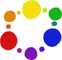
The first thing you need to learn is the color wheel.

When mixing colors in real life, there are three colors you can't mix others to get: Red, Yellow and Blue (Magenta, Yellow and Cyan according to some). These are called Primary Colors.

If you mix two primary colors together, there are three possible outcomes: Purple, Orange and Green. These are called Secondary colors.

All colors after that are called tertiary colors.

As a general rule, colors opposite or next to each other on the color wheel go well together.


merging_colors_by_nin_wolf-d72ge3y.png

Next up! To the left you have two eye-burning colors. It hurts just looking at them! However, by adding white to the image, it suddenly becomes much more pleasant!

This is an useful technique for making clashing color combinations work together. Most light colors, and to a lesser extent black and grey, also work as "meddling colors".

color_use_darkness_and_light_by_nin_wolf-d72tjjr.png

The next thing about color to keep in mind is contrast and light levels.

In figure A, we have three strong colors. These are high contrast. As a general rule, try to avoid using too much high-contrast colors, as this will make the viewer more blind than anything else.

Figure B are the same colors, but greyed out. They are in other words low contrast. They are a bit boring to look at, but much more easy on the eyes.

In Figure C the colors are lighter and in figure D they are darker.

Despite all being red, blue and yellow, by messing with the contrast and light levels we can make them work together differently.

color_different_lights_by_nin_wolf-d72tlsd.png

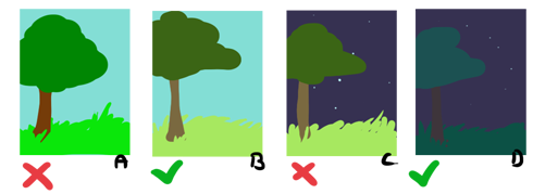
Did you know that when you draw human skin in the night, you use purple?
No, I'm not joking. You do that.
This relates to the last color lesson here, relations between different colors and lights!

The colors we use will look different when paired with different colors, and even though they appear to be the same, one object will require completely different colors in various situations.

Figure A. We all did this as children. Grass is green, bark is brown and the sky blue. But when you look at it, it looks really... off. It doesn't look like this at all in real life!

Figure B. Instead of using bright green, I used a light yellowish green. Suddenly, the grass feels much more natural. The bark has also become more light and yellowish. The sky is the same however.

Figure C. Now lets draw the same scene when its night! Here I used the exact same colors as in figure B, but it doesn't look like night at all!

Figure D. This time, I used a dark greenish blue for the grass. Not it looks like night!

This is something you can learn by observing the world around you. Try different colors, and most of all trust your own eye to know you've chosen the correct color!


Useful Links and Resources

http://colorschemedesigner.com/
A wonderful site for anyone who wants quick access to various color palettes! The concept of the site itself is a great example of how many ways there are to determine the 'perfect colors'. If you're interested in a challenge, why not go to Random > Randomise Palette and use whatever you get out of it ;)

http://aquasixio.deviantart.com/art/Tutorial-17-A-turtle-walkthrough-345468329?q=favby%3ANin-Wolf%2F49257348&qo=4
How to pick colors - Turtle version. The tutorial is a bit crowded, but its an interesting perspective. The arist him/herself have some stunning paintings color-wise, why not check them out for inspiration?

http://purplekecleon.deviantart.com/art/How-I-See-Color-A-Tutorial-184642625
A massive tutorial from Purplekecleon. She is an incredibly talented person, especially when it comes to colors and have greatly influenced myself on how I view it. The tutorial is long, and can get a bit hard to read, so take one chapter at a time.
[center][size=6][b]Shading Theory[/b][/size] [size=4]How to shade a variety of things[/size][/center] Shading is where you start to make things look like thing (how wise). Like color theory, this is a big (if not even bigger) area where many people have different opinions. I will teach you some general rules regarding shading as well as how to create certain objects/effects, such as metal. But as always, remember this is only learning the rules - feel free to break them afterwards~ -_-_-_-_-_-_-_-_-_-_-_-_-_-_-_-_-_-_-_-_-_-_-_-_-_-_-_- The first thing to keep in mind: [b]NEVER use pure black and pure white when shading![/b] Well, ok, you can use it (everything has its uses - like a few sentences down), but its a fast way to drain an image of its colors. Even in real life its unusual for shadows to be purely black and for the light to be purely white, isn't it? By using slightly colored tones instead, you'll add so much more. Also, when shading a color, try to avoid using a darker version of that color. It will just look flat, unles you're going for the monochrome look. [u][b][size=5]Shapes[/size][/b][/u] [img]http://fc07.deviantart.net/fs70/f/2014/019/c/c/shading_1_by_nin_wolf-d72uhvb.png[/img] When shading, its important to keep the objects shape in mind. Here's a scarf. Its a very cool scarf. But it needed to be about 20% cooler so I added a pattern to it. However, as you can see in figure B it doesn't really look very good does it. This is actually one of the reasons you shouldn't overuse textures as well. Since its a flat pattern laid on top of a shape, it doesn't match well. Of note however is that several drawing styles make use of this flat effect (myself included) and its commonly used as a time saver, but enough about that right now. In figure C, I added the pattern so it matched the shape of the scarf. Thanks to the pattern you should now be able to see the shape of the scarf much more easily. Its by forcing seeing these invisible shapes into our heads that we can then shade them. Its a matter of training. [img]http://fc01.deviantart.net/fs70/f/2014/019/f/0/shading_2_by_nin_wolf-d72uklv.png[/img] A good way to train your sense of shape is to draw simple shapes like cubes, cylinders, prisms and balls. Try to shade them and make them LOOK like they're there! This also leads us into the next area of interest... [u][b][size=5]Environmental Light[/size][/b][/u] [img]http://fc00.deviantart.net/fs71/f/2014/019/4/e/shading_3_by_nin_wolf-d72uno9.png[/img] When we talk about light, we usually think the most obvious light sources: the sun, lamps, the lightweaver etc... however, as a matter of fact everything can become a light source thanks to reflection. When the light from a light source hits an object, it is going to reflect the light to a degree. This is the whole the reason the moon shines in the first place, for example. This light can then hit other objects. By adding this "environmental light", the light reflected from the environment, we can greatly increase how well different objects interact with each other. This technique can be surprisingly useful when making a skin. For example, by adding a orange-yellow light to your skin, you can create the illusion of the dragon being surrounded by flames or being in a fiery climate. [u][b][size=5]Specific Objects[/size][/b][/u] [img]http://fc01.deviantart.net/fs70/f/2014/041/4/3/shading_4_by_nin_wolf-d75xc3g.png[/img] [b]Metals[/b] Metals are fun, so I will go through one way you can draw them! 1. Base. For this tutorial, I'm drawing some kind of apparel. 2. First off I give it some toning. You actually don't have to do this, but I think it adds some depth to it. Note that while the base color is gold, the shading on this apparel is actually a red hue. 3. Now I've added these stripes to it. When I learned how do draw metal, we always used stripes, but i guess not everyone does it, nor does metal in the real world always use that. [i]My entire life has been a lie[/i] but it does add to it! 4. Now we're adding contrast, and this is where it really feels like metal! The wonderful thing with metallic surfaces is that it can bend the light in strange ways, so don't be afraid to experiment with it. Note that the highlight is put along the edges, with a few stripes across the part of the apparel that is hit by the light. 5. Now I've added highlights on the bottom part. Even though the light shouldn't reach there, this does give it an extra metallic gleam, doesn't it. 6. Some extra shading and messing with the lineart. The same technique can be used for things like gems and glass.
Shading Theory
How to shade a variety of things

Shading is where you start to make things look like thing (how wise). Like color theory, this is a big (if not even bigger) area where many people have different opinions.

I will teach you some general rules regarding shading as well as how to create certain objects/effects, such as metal. But as always, remember this is only learning the rules - feel free to break them afterwards~

-_-_-_-_-_-_-_-_-_-_-_-_-_-_-_-_-_-_-_-_-_-_-_-_-_-_-_-

The first thing to keep in mind:
NEVER use pure black and pure white when shading!
Well, ok, you can use it (everything has its uses - like a few sentences down), but its a fast way to drain an image of its colors. Even in real life its unusual for shadows to be purely black and for the light to be purely white, isn't it? By using slightly colored tones instead, you'll add so much more.
Also, when shading a color, try to avoid using a darker version of that color. It will just look flat, unles you're going for the monochrome look.


Shapes


shading_1_by_nin_wolf-d72uhvb.png

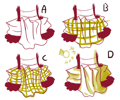
When shading, its important to keep the objects shape in mind.

Here's a scarf. Its a very cool scarf. But it needed to be about 20% cooler so I added a pattern to it. However, as you can see in figure B it doesn't really look very good does it. This is actually one of the reasons you shouldn't overuse textures as well. Since its a flat pattern laid on top of a shape, it doesn't match well.

Of note however is that several drawing styles make use of this flat effect (myself included) and its commonly used as a time saver, but enough about that right now.

In figure C, I added the pattern so it matched the shape of the scarf. Thanks to the pattern you should now be able to see the shape of the scarf much more easily.

Its by forcing seeing these invisible shapes into our heads that we can then shade them. Its a matter of training.

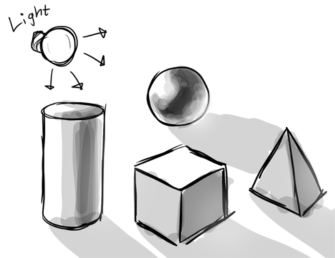
shading_2_by_nin_wolf-d72uklv.png

A good way to train your sense of shape is to draw simple shapes like cubes, cylinders, prisms and balls. Try to shade them and make them LOOK like they're there!

This also leads us into the next area of interest...


Environmental Light

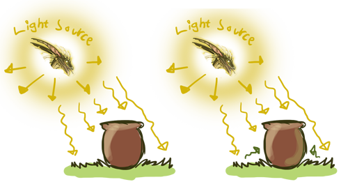
shading_3_by_nin_wolf-d72uno9.png

When we talk about light, we usually think the most obvious light sources: the sun, lamps, the lightweaver etc... however, as a matter of fact everything can become a light source thanks to reflection.

When the light from a light source hits an object, it is going to reflect the light to a degree. This is the whole the reason the moon shines in the first place, for example. This light can then hit other objects. By adding this "environmental light", the light reflected from the environment, we can greatly increase how well different objects interact with each other.

This technique can be surprisingly useful when making a skin. For example, by adding a orange-yellow light to your skin, you can create the illusion of the dragon being surrounded by flames or being in a fiery climate.

Specific Objects

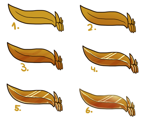
shading_4_by_nin_wolf-d75xc3g.png

Metals

Metals are fun, so I will go through one way you can draw them!

1. Base. For this tutorial, I'm drawing some kind of apparel.

2. First off I give it some toning. You actually don't have to do this, but I think it adds some depth to it. Note that while the base color is gold, the shading on this apparel is actually a red hue.

3. Now I've added these stripes to it. When I learned how do draw metal, we always used stripes, but i guess not everyone does it, nor does metal in the real world always use that. My entire life has been a lie but it does add to it!

4. Now we're adding contrast, and this is where it really feels like metal! The wonderful thing with metallic surfaces is that it can bend the light in strange ways, so don't be afraid to experiment with it. Note that the highlight is put along the edges, with a few stripes across the part of the apparel that is hit by the light.

5. Now I've added highlights on the bottom part. Even though the light shouldn't reach there, this does give it an extra metallic gleam, doesn't it.

6. Some extra shading and messing with the lineart.

The same technique can be used for things like gems and glass.
X
X
This is actually a really great thread! Lots of useful information! Love the bits for the general art theory and such haha! Such a nice touch!
fr_banner_by_kechk-dbaklf1.jpg
@Kechk

Thanks ^^
Hopefully I'll find the inspiration to finish this one day!
@Kechk

Thanks ^^
Hopefully I'll find the inspiration to finish this one day!
@CinnamonThief, this is lovely! Please continue!
_________SmBLerv.png_ _ __SwjxiXr.png_ _ __2lLWOc3.png_ _ __E4B4gsl.png_ _ __rkoKRrQ.png_
1 2