Back

Creative Corner

Share your own art and stories, or ask for critique.
TOPIC | Let me Crit your Anatomy -Human/Creature
Howdy boys.

Got finished with Animal Anatomy and Human Anatomy at my art school and I guess I'm feeling a little withdrawal. I like to teach, so, show me your art to critique/ask me for help with?
Howdy boys.

Got finished with Animal Anatomy and Human Anatomy at my art school and I guess I'm feeling a little withdrawal. I like to teach, so, show me your art to critique/ask me for help with?
She/He
Pan - Poly
Drew / Lemons
1tpb8sw.gif
@Lemonsinasoup oh i'd love to get in on this

first of all, would love another pair of eyes on this to tell me why the face is wrong. i THINK it's that the eye is out of plane/incorrectly foreshortened and the ear is in the wrong place but i don't draw humans very often and am really trying to improve so would love a second opinion!

and if possible i'd also love to hear your thoughts on some of my creatures! these are all FR examples cos it's what i've been drawing recently haha, i'm fairly happy with where they're at but a fresh perspective is really useful in case i'm goofing somewhere with my shapes/structures.
one
two
three

thanks for your time! :D
XfL644W.png
WhPZGJa.png
@corvidus Ok, sorry for the delay on this! Ooh man, your painting is so NICE. You got fabric down so hard. For the face, it's a combo of things I think- primarily the ear looks really high up? In general the skull seems really flat and deep- like, too wide from the side. I'm not sure the stylized eyes are very helpful, I think they could use a small size adjustment to make them smaller, to make room for the temporalis to ear area. I think the ear is technically in the right place, it's just the area around it is making it look too high. Generally... Where the jaw kinda sinks back into the neck is more or less a good reference point to where to put the ear. The eye could also be set deeper, if you wanted to push closer to reality, but I don't think it's necessary. The lips are giving me an issue, I'm having trouble seeing exactly what it is, I think part of it is how thin the lips are, and how they seem to be all one thickness, as opposed to the frontmost of the lip being thickest. That could just be a stylistic thing, too. Just feels like a lot of noise at that part of the face that takes away from the rest of the piece, I suppose. The nose to chin area feels a little bit squished, in general I think. not much of a chin, lips feel just barely too thin, and the philtrum also feels just slightly short, it seems to be going up into the nose as opposed to attaching where the nose hits the face- it's going in a bit much. Probably not worth concerning yourself about in this particular piece, just something to keep in mind for the next. That is to say, in a much too nit-picky way, I think just more study of proportions will be good for you. Here's a bad hasty little sketch. [img]https://i.imgur.com/eCoQQF6.png[/img] As for the others, I think the biggest issue I have with them isn't anatomy, but maybe the size of canvas or dpi or line thickness... I have trouble reading some things, the guardian and mirror nuzzling was hard to read at first glance, but part of that is just FR's innate busy-ness of apparel. The jaw and torso of the mirror work really well though, although the arm reaching up might be a little short? The banescale really rocks, solid legs. It just has the same linear issue where I think some of your forms are getting lost in the sketchy lines. I think It can still work- just by working with a larger canvas/higher dpi. Just so we get to see more of the form. Obviously that's another style thing though and sometimes just not what you want to do with a piece, as I'm assuming with these. The placement of the wings might be a liiiitle off? I'm not sure based on a lack of scapular form what 'flexibility' the wing might have, but the far wing might be attatching somewhat low, compared to the foremost. If you're implying the whole body is tilting somewhat, which could be really cool, I think seeing more of the underbelly and more weight on the tilted arm would work well for that. Another poor draw-through for you, as I rush to prep for D&D today. [img]https://i.imgur.com/eEPm70Z.png[/img] And.. there! Again, really really nit-picky and probably preference-bias.Your painting is stellar, and all these works are truly gorgeous! Hope this doesn't sound mean, I'm just personally sick of vague positive critique on my own pieces LOL
@corvidus

Ok, sorry for the delay on this!

Ooh man, your painting is so NICE. You got fabric down so hard.

For the face, it's a combo of things I think- primarily the ear looks really high up? In general the skull seems really flat and deep- like, too wide from the side. I'm not sure the stylized eyes are very helpful, I think they could use a small size adjustment to make them smaller, to make room for the temporalis to ear area. I think the ear is technically in the right place, it's just the area around it is making it look too high. Generally... Where the jaw kinda sinks back into the neck is more or less a good reference point to where to put the ear.

The eye could also be set deeper, if you wanted to push closer to reality, but I don't think it's necessary.

The lips are giving me an issue, I'm having trouble seeing exactly what it is, I think part of it is how thin the lips are, and how they seem to be all one thickness, as opposed to the frontmost of the lip being thickest. That could just be a stylistic thing, too. Just feels like a lot of noise at that part of the face that takes away from the rest of the piece, I suppose.

The nose to chin area feels a little bit squished, in general I think. not much of a chin, lips feel just barely too thin, and the philtrum also feels just slightly short, it seems to be going up into the nose as opposed to attaching where the nose hits the face- it's going in a bit much. Probably not worth concerning yourself about in this particular piece, just something to keep in mind for the next.

That is to say, in a much too nit-picky way, I think just more study of proportions will be good for you.

Here's a bad hasty little sketch. eCoQQF6.png

As for the others, I think the biggest issue I have with them isn't anatomy, but maybe the size of canvas or dpi or line thickness... I have trouble reading some things, the guardian and mirror nuzzling was hard to read at first glance, but part of that is just FR's innate busy-ness of apparel. The jaw and torso of the mirror work really well though, although the arm reaching up might be a little short?

The banescale really rocks, solid legs. It just has the same linear issue where I think some of your forms are getting lost in the sketchy lines. I think It can still work- just by working with a larger canvas/higher dpi. Just so we get to see more of the form. Obviously that's another style thing though and sometimes just not what you want to do with a piece, as I'm assuming with these.
The placement of the wings might be a liiiitle off? I'm not sure based on a lack of scapular form what 'flexibility' the wing might have, but the far wing might be attatching somewhat low, compared to the foremost. If you're implying the whole body is tilting somewhat, which could be really cool, I think seeing more of the underbelly and more weight on the tilted arm would work well for that.

Another poor draw-through for you, as I rush to prep for D&D today.
eEPm70Z.png


And.. there! Again, really really nit-picky and probably preference-bias.Your painting is stellar, and all these works are truly gorgeous! Hope this doesn't sound mean, I'm just personally sick of vague positive critique on my own pieces LOL
She/He
Pan - Poly
Drew / Lemons
1tpb8sw.gif
@Lemonsinasoup
this is really thorough, thanks for taking the time to write it all up! the thing about the canvas size is interesting - i usually work on a canvas size of 1500-2000px for the sketches, so it's not small exactly, but i know tumblr's image hosting makes things super blurry so maybe that's to blame haha.
thanks again!
XfL644W.png
WhPZGJa.png
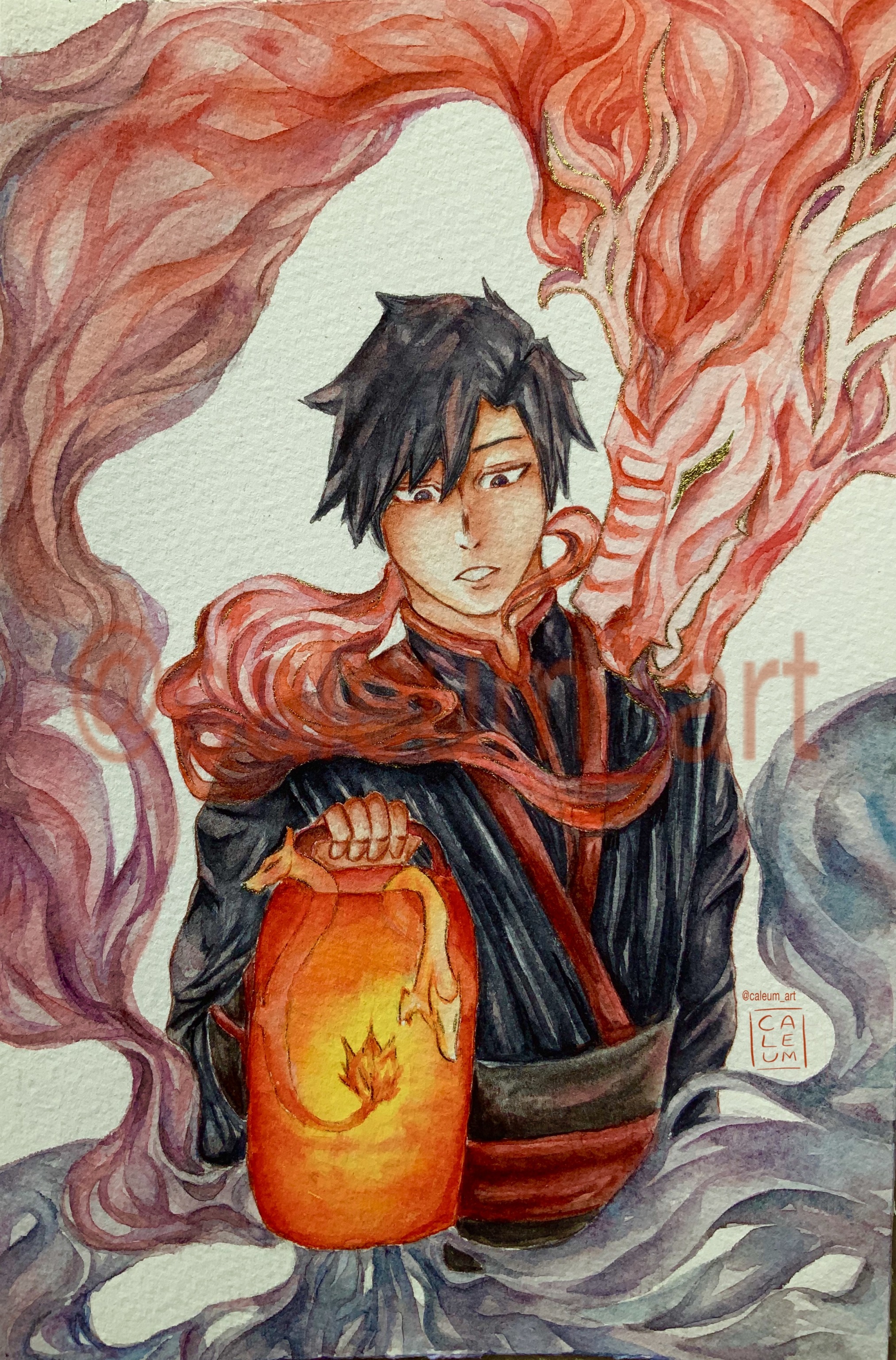
@Lemonsinasoup Mind critiquing this piece (or any of the pieces in my artshop)? [img]https://66.media.tumblr.com/f12ed022f779dfae56b764557a972983/8d3664b6d4bfcc76-a1/s2048x3072/e48728e7b3ca4f5c4c3e4b2fc42fd2eb11566aad.jpg[/img] I don't really like how the hand is done and the left side of the shoulder/neck junction. the neck base seems too thick for how the clothes cling to it.
@Lemonsinasoup

Mind critiquing this piece (or any of the pieces in my artshop)?

e48728e7b3ca4f5c4c3e4b2fc42fd2eb11566aad.jpg

I don't really like how the hand is done and the left side of the shoulder/neck junction. the neck base seems too thick for how the clothes cling to it.
a33cd48e8e24f11bf61861e1609632aa217f8a3e.jpg7cd0b45f35c6e34590a300be1cacd27b2edf7760.png1500b320d1a9d96d3a57fed65894bfb47c744792.jpg92d2f8ce3a437d3f75d1b9b4944f46633f33d821.png