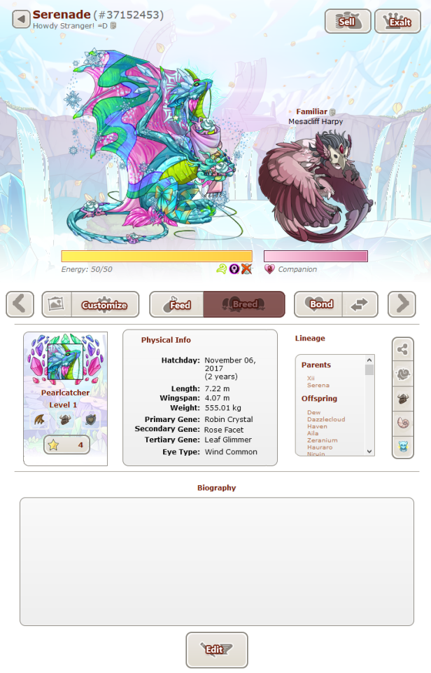
Hi! I also made my own mock-up of changes I'd like to see for the dragon profile page.
Wow, thanks for all the feedback and the overwhelmingly positive responses! I updated the mock-up based on all the feedback here some more. ^^
[b]Mock-Up 4.0:[/b]
[img]https://66.media.tumblr.com/0e01ea4ab7da4a10081e076d3018e261/89a534147f753341-0c/s640x960/e369b8fcc712ffa371c68a91d953b987943a1cf7.png[/img]
[b]Mock-Up 4.1:[/b]
[img]https://66.media.tumblr.com/ee770a2c3517839c0efec312596caf80/89a534147f753341-70/s1280x1920/baa19d2b3afa810720ec29c17bffb76e40a63685.gif[/img]
[b]Changes:[/b]
[LIST]
[*]Only the dragon and familiar are displayed at the top. These two are the stars of the show anyway. ^^
[*]The vista section has been moved up and removed from the dragon's biography. This leaves the bio box intact, saving space on longer bios. Adding the vista to the informational section with physical info/lineage creates a nice passport or ID card kind of feel to it.
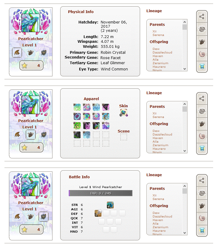
[*]The three icons on the vista function as tab buttons, allowing the middle section to change between displaying physical info, apparel info and battle info. This way, all information is still available on a dragon's profile page, without cluttering it up and causing an information overload.
[*]The likes button was moved to the vista box. It seems a bit weird to have it sort of dangling under a row of buttons and it just looks nice on the vista. ^^
[*]Information at the top has been replaced by a little personalised broadcast message option. I’ve seen many people say the pronounced ‘male/female’ label caused them dysphoria, so it’s been removed and replaced with an icon under the energy bar. The breed and level are moved to the vista section. (See also [url=https://www1.flightrising.com/forums/sug/2870743]this suggestion[/url] by @Rookie and [url=https://www1.flightrising.com/forums/sug/2870743/2#post_43592428]this comment[/url] by @Nabesima.)
[*]The sidebar next to the lineage shows the share and morphology buttons, as well as the apparel/skin, scene, and vista buttons that’ll instantly take you to the customisation screens, so it doesn’t require an extra click to get there.
[*]I made the big buttons underneath the dragon and familiar a bit shorter so it looks less clunky.
[*]The font of the physical info is bigger, so people can read it better.
[/LIST]
[b]Changes Mock-Up 4.0:[/b]
[LIST]
[*]The row of buttons underneath the dragon and familiar are smaller.
[*]The scenic view button was moved from the top to the row of buttons.
[*]The very large previous/next dragon buttons have been moved to the row of buttons as well.
[*]The physical info/battle info/apparel info boxes in the middle are now in a box.
[/LIST]
[b]List of decentred dragon on all the backgrounds:[/b]
[center][url=https://66.media.tumblr.com/5f98f99ed3aba83584a98eb86a105b47/643f9dac261b2905-e3/s1280x1920/995ab5a4220b770ec1a5c46b831efacb94f89167.png]Autumn Clearing[/url] | [url=https://66.media.tumblr.com/c14b106dad5f7796e910b720276035db/643f9dac261b2905-94/s1280x1920/d14d88a0f46a20eda28f5f099c5be5ff95c71979.png]Foxfire Grove[/url] | [url=https://66.media.tumblr.com/467aad5661f40306dbd35b33d9db4ce4/643f9dac261b2905-c2/s1280x1920/856eb01bae22f46b6c587191d6158a74d0a8bd32.png]Frostbite Falls[/url] | [url=https://66.media.tumblr.com/aeca49f0fc362e3f8d2e5e93217714ea/643f9dac261b2905-7b/s1280x1920/30a5d6f10dfd8c8ec03238806c281ebc4b28da67.png]Webfiend Cave[/url]
[url=https://66.media.tumblr.com/f45c27bc2762e7f90b0c8b45bf66aa65/643f9dac261b2905-47/s1280x1920/1e0482b26c7c5844d2ffdcc4bec02858641f004d.png]Pillow Palace[/url] | [url=https://66.media.tumblr.com/e1a832e99876e0c6a843a33fbc87ab6c/643f9dac261b2905-48/s1280x1920/4e92e39e565d2e71c6244873ea61548c34cf069c.png]Moonbeam Aquaduct[/url] | [url=https://66.media.tumblr.com/9749d245c411d410e0eb5fe705f8e3ae/643f9dac261b2905-e3/s1280x1920/6cab7ea1ced5bfc7f60584d88dac58180bd89af4.png]Rocky Refuge[/url] | [url=https://66.media.tumblr.com/a9b9d5685988fbf714d4545fc0c696eb/643f9dac261b2905-ab/s1280x1920/42a0a249858ef63f08132acdaa22c0c75b37d77a.png]Royal Chambers[/url]
[url=https://66.media.tumblr.com/009b9fdc323a125a3719616f17efe9f9/e1d027cf7fe54dd2-cb/s1280x1920/102c864144c909815fd29c112b9c9c97719ffed8.png]Shoreline Serenity[/url] | [url=https://66.media.tumblr.com/89f656e86c307baaa6bba7213b6a42f0/e1d027cf7fe54dd2-77/s1280x1920/544510059214d7ab009ad3014cc93d62b5ce49c9.png]Starksand Dunes[/url] | [url=https://66.media.tumblr.com/dc1526065c0d8f39e4dfdbbe489b6315/e1d027cf7fe54dd2-1c/s1280x1920/daab9d2804a8c534d2f0dd15df08aa3e676db32c.png]Titan's Fall[/url] | [url=https://66.media.tumblr.com/dbac2e4d8d71f1b41363ac6803c62a73/e1d027cf7fe54dd2-02/s1280x1920/2cc2a91962cf52ea2643b18025bc4006bb13d52e.png]Remembrance[/url][/center]
[url=https://66.media.tumblr.com/8578749a9981f803659e647d53b32927/aba0dbf08f0a0ed1-ef/s1280x1920/b6ad89ebe06e7ae87daabf8e16cb8e39e5f0be81.png]Mock-up 1[/url] || [url=https://66.media.tumblr.com/c85a64fce2ff7854bff32f11c047a2bf/98c3ae7d50ec6ef4-87/s540x810/69df8c05510888adb4baf33a5645cf87574aa837.png]Mock-up 2[/url] || [url=https://66.media.tumblr.com/def39d0656251bbdfc10e91307e3d577/f025f886b1145be1-3a/s1280x1920/6cf9f1c56aa1d896279a6c3590ae758e0f7dea0a.gif]Mock-up 3[/url]
Hi! I also made my own mock-up of changes I'd like to see for the dragon profile page.
Wow, thanks for all the feedback and the overwhelmingly positive responses! I updated the mock-up based on all the feedback here some more. ^^
Mock-Up 4.0:
 Mock-Up 4.1:
 Changes:
- Only the dragon and familiar are displayed at the top. These two are the stars of the show anyway. ^^
- The vista section has been moved up and removed from the dragon's biography. This leaves the bio box intact, saving space on longer bios. Adding the vista to the informational section with physical info/lineage creates a nice passport or ID card kind of feel to it.
- The three icons on the vista function as tab buttons, allowing the middle section to change between displaying physical info, apparel info and battle info. This way, all information is still available on a dragon's profile page, without cluttering it up and causing an information overload.
- The likes button was moved to the vista box. It seems a bit weird to have it sort of dangling under a row of buttons and it just looks nice on the vista. ^^
- Information at the top has been replaced by a little personalised broadcast message option. I’ve seen many people say the pronounced ‘male/female’ label caused them dysphoria, so it’s been removed and replaced with an icon under the energy bar. The breed and level are moved to the vista section. (See also this suggestion by @Rookie and this comment by @Nabesima.)
- The sidebar next to the lineage shows the share and morphology buttons, as well as the apparel/skin, scene, and vista buttons that’ll instantly take you to the customisation screens, so it doesn’t require an extra click to get there.
- I made the big buttons underneath the dragon and familiar a bit shorter so it looks less clunky.
- The font of the physical info is bigger, so people can read it better.
Changes Mock-Up 4.0:
- The row of buttons underneath the dragon and familiar are smaller.
- The scenic view button was moved from the top to the row of buttons.
- The very large previous/next dragon buttons have been moved to the row of buttons as well.
- The physical info/battle info/apparel info boxes in the middle are now in a box.
List of decentred dragon on all the backgrounds:
Mock-up 1 ||
Mock-up 2 ||
Mock-up 3
I like where you put the vista. A passport or ID card feel is better!
I like where you put the vista. A passport or ID card feel is better!
I like having the top less cluttered!
The empty vista box looks a bit odd - I wonder if it'd work to put the physical info text in there? It'd have even more of a passport feel!
I like having the top less cluttered!
The empty vista box looks a bit odd - I wonder if it'd work to put the physical info text in there? It'd have even more of a passport feel!
@
nika
Oh yeah, that's a good point!
I don't know if all the info can be put in there, but maybe some of the icons, like the flight/den/breeding cooldown/male/female.. And at least the birth date could be added there too. That would also leave some space to increase the font on physical info a bit for those who need it. Oh, or maybe likes could be moved there too?
Support! I like this layout you've made a lot - I almost never need to look at the battle or apparel info, so having them both take up so much space makes no sense to me. Also really like the vista placement.
Support! I like this layout you've made a lot - I almost never need to look at the battle or apparel info, so having them both take up so much space makes no sense to me. Also really like the vista placement.
I really like the dragon and familiar being the only things at the top and given some breathing space!
Not sure about how the rest of it would work though without being too cluttered/requiring too many clicks. As is you can just click skin/apparel to get to the apparel/skin selection/editor, but for this mock-up you need to click into apparel and then click into the editor.
I agree with the suggestion that physical info would look nice within the vista section, if it could be made to fit. The apparel/skin/scene and battle stats/info sections could be stacked on top of each other and the vista/physical info/apparel info/battle info/lineage could be extended vertically to make room for that so there should be enough room in the vista for physical info. It'd probably look odd though aha
EDIT: words are hard haha
I'm definitely a fan of the decluttering going on in the upper part, and I personally like the dropdown/popup solution for the apparel list and battle info too
I also love the Vista being where it is instead of messing with the bio (redoing bio codes aside, I think it really doesn't mesh well with longer bios as it is now). I agree with there maybe needing to be something else on it to fill the space, and the already true and tried icons/emoji sound like a good idea. Definitely not the fan of putting physical information on it though - you cannot fit all of that in there without reducing text size even more (and a lot of it is already too small imo) and only fitting some text in there while keeping the rest under "physical info" would sacrafice clarity and organisation, I think
Anyway, I'm absolutely in favour of this overall! Feels a lot less overwhelming to look at than what we currently have
What I like a lot about this is that you brought in the vista! What a cool idea! At first glance too I thought that this might show that pressing apparel or battle would change the middle gene section to instead read as one of those two pieces of info, like tabs, and that seemed classy as well!
This still keeps the big buttons under the dragon though which are my least favorite part I think, but wanted to comment to say your spacing and vista ideas are huge successes! :D
Oh I absolutely love the addition of having the vista in the info area rather than the bio!
It's... fine right now, if your bio is fine with being squished, but it just ruins coding so easily.
I definitely gotta say support!
Oh I absolutely love the addition of having the vista in the info area rather than the bio!
It's... fine right now, if your bio is fine with being squished, but it just ruins coding so easily.
I definitely gotta say support!
|
xxx
|

|
xx
|
"GYAH HA HA! Not if I crash your big finish!"
e
e
|
I updated with your feedback/comments/suggestions in mind. Apologies if you didn't want to be pinged about this!
@
nika The vista box now has stuff in it! =D
@
Desmordus I made an update to address your comment about the extra clicks needed to edit apparel/scenes. Please let me know what you think!
@
CrownedLadybug You're right about all the physical info not fitting and it being a bad idea to split it up. I hope you like the alternative idea I came up with to fill in the vista box. ^^
@
BladesFire I made the buttons shorter, so they're not quite as big and clunky. I think it's a great improvement, but they're still pretty big. What do you think?
